JD Power
Understanding people’s car buying behaviors and preferences for creating a direct-to-consumer website
Case study coming soon
Methods
Remote usability
In-person usability
1:1 interviews
Concept testing
Role - Research Lead
Research planning
Recruiting
Selecting participants
Writing moderator scripts
Recording data
Synthesizing research
Timeline
4 weeks
2 UX designers, 1 researcher, [stakeholders]
My role: lead researcher
Responsibilities: research planning, writing moderator guides, running usability tests,
About…
JD Power known for its awards, re-design a website that was direct-to-consumer within a tight timeline.
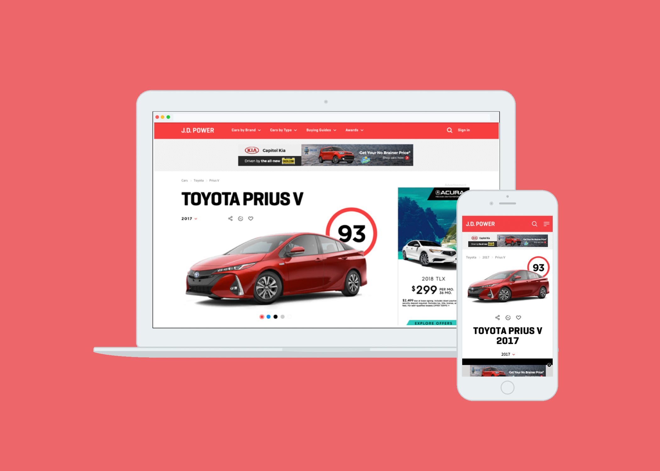
Re-introducing the JD Power Brand, creating a D2C website
Our team helped J.D. Power capitalize on the strength of their brand to create a clean and simple online car shopping experience. The design provides ratings and research, instantly conveys confidence, and stands out from the competition.
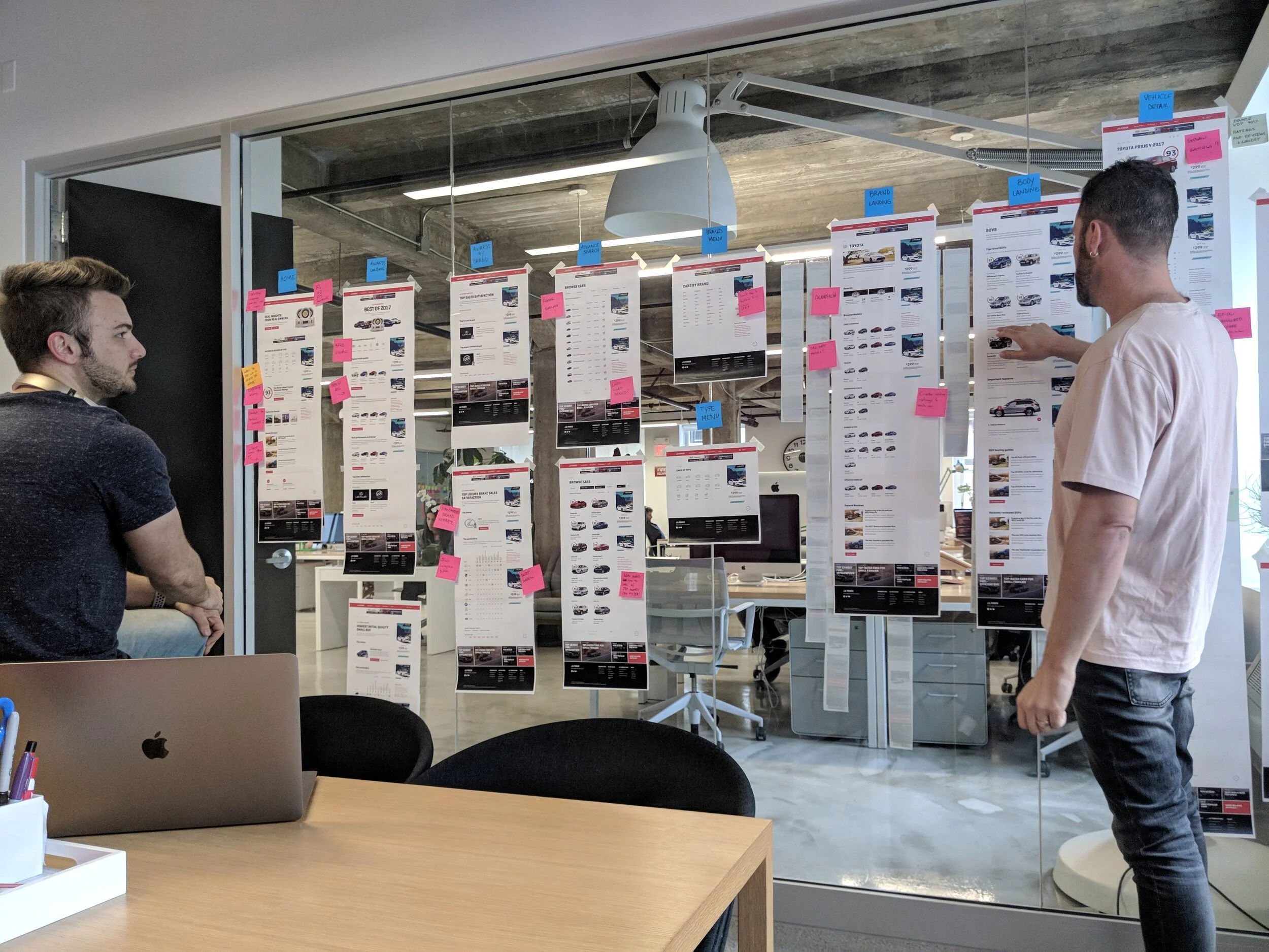
Process
Methodology - Remote user testing/building website from scratch
Over the course of 4 weeks from 1/25/18 - 3/8/18, we tested mobile and desktop concepts with a total of 24 participants through 1-hour video interviews.
7 JD Power users; 17 non-JD Power users.
13 participants preferred to use a desktop computer to browse; 9 preferred to use a mobile device to browse; 2 had no preference.
11 participants recently purchased a car; 13 said they were currently looking to buy a car.
Key Findings
Discovery of new information: People appreciated having features and additional details that help them discover new information they wouldn’t have thought of themselves.
Clarifying the JD Power rating: Most participants didn't understand the rating upon first glance of the Vehicle Detail Page, or how it was derived, although they knew they could click in to learn more. Despite reading more about the score in the description and clicking through the website, many still wanted to know more details about the methodology behind how the score was derived.
Using both mobile and desktop: Most participants use both desktop and mobile devices in their car research journey, and appreciated that the mobile website design offered the same experience as the desktop, with the exception of some additional required scrolling on the mobile version.
The need to compare: People want to be able to easily compare cars/models, and gravitated towards features that allowed them to do so (i.e. Years of models on Vehicle Detail Page and SUV type page, “You might be interested in” comparison, pricing section, “vs” button next to social media buttons, comparison charts on the Awards pages).
Wanting unbiased information: People expect a third-party site like JD Power to be unbiased. In the last couple rounds of testing, some thought the imbalance/placement of the ads on the page made the awards seem biased.
Recommendations
Include the right level of details to help users make better informed decisions in their car buying experience.
Remind and educate the user in regards to what the rating means throughout the experience.
Ensure parity of the mobile and desktop experiences for user ease of use.
Include features that allow people to easily compare information.
Be mindful of ad placements to prevent the perception of bias.
Impact
Using our designs and recommendations, JD Power published the website. (jdpower.com)
Our research was the foundation of the website.
Design a new look - Typical car research sites are a mess - littered with content, very hard to find what you’re looking for. Wanted it to feel clean and simple.
Ratings - Ratings and ability to research - ratings most valuable content on the sight. Move from 5 star system to a new 100 point scale to make it easier for customers to rate vehicles
Comparisons - charts
Mobile - easy to read on a small screen
Native ads - integrating ads without interfering with experience
Challenges/constraints:
Information architecture
Legacy information